Beautiful Website Week 3
For the background, a colorful color with texture was used on this website, because this website is about color. So was exploring with a lot of color.
For the font, it was big enough for reader to read it. And was using different font for title, heading and body text. Easily for recognize.
For the images, a lot of images was used on this website and the size of images clear enough to view it. Some of graphic style image was appear on this website to represent graphic with color.
For the layout, just a simple layout was used. Similar as with blog layout, easier for read all content.
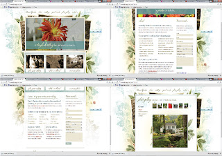
For the background, a simple color with romance feeling on this website. It very match to the theme. And some flower texture was used too. Make a different feel for reader.
For the font, it was suitable for this wedding theme website, and also not using a lot of typeface on this website.While the color of text, just using 2 colors on it.
For the images, the main for the images is big and clear enough for reader to view it.
For the layout,it is a simple arrangement on this website. It doesn't have many of column.So, reader can easy to find out what information that they need.
For the background, it just a simple color and blank background. Although it was simple, but it was give a reader a clean feeling.
For the text, a special font on title, and other than that is simple font. Even it was simple, but it was giving reader a clean feeling for the font.
For the images, a lot of graphic style images on this website, and for arrangement of images is simple way on it.
For the layout, simple and easier layout for reader, it was easy for reader to find what they want. There also put for information with simple way too.
Overall on it, this website also got applied flash on the top page of website.
For the background, a texture with grey color was applied on this website, and some decorative also was applied on it. So , it won't getting boring with the background.
For the text, a special font applied on navigation bar there. For the other just a simple font with nice arrangement. Even it's was simple , but it was applied hierarchy for font. Easy to find out where is heading where is body type for reader.
For the images, just a few of images was used on this website. Because it just appear on top page on this website.
For the layout, also similar with blog layout. But the way, below part of website, we can find out a site-map of this website. A way to make reader find out information easier.


.jpg)


0 comments: