Wednesday, September 26, 2012

Beautiful website week 4


For the background, it was soft and warm color , give reader an old style color scheme feeling.  

For the font, quite nice for the title, it was overlay with texture. Make the font came out. 

For the images, a animation style images. Because this website is about a story of animation.

For the layout, quite special for loading bar. And other than that is was using simply layout , although it was simply, but still give a reader comfortable feeling.   


For the background, a dark color and with some texture background on it. Make the object contrast with it. Easier for reader read out all the content.  

For the font, a simply font was applied on this website. But for the body text, quite hard to give reader read it, cause of the size of font is a bit small. 

For the images, a lot of images was using, because this website is about a portfolio of design and photography. And for image that on main page, it was big and clear enough for reader to grab attention.

For the layout, was apply a grid system on it . Nice arrangement with overall website. Easy for reader understand which part is which part. 


For the background, 4 different background was applied on this website and give a reader a different feeling with each background. 

For the font, was creating a hierarchy for the font system. Readable for reader to grab attention on it. Easily to know where is heading where is body text . 

For the images, it was big and clear enough for reader understand. Especially 4 different background with 4 different main images.

For the layout, nice arrangement on overall, not confusing while we read all of the content. 


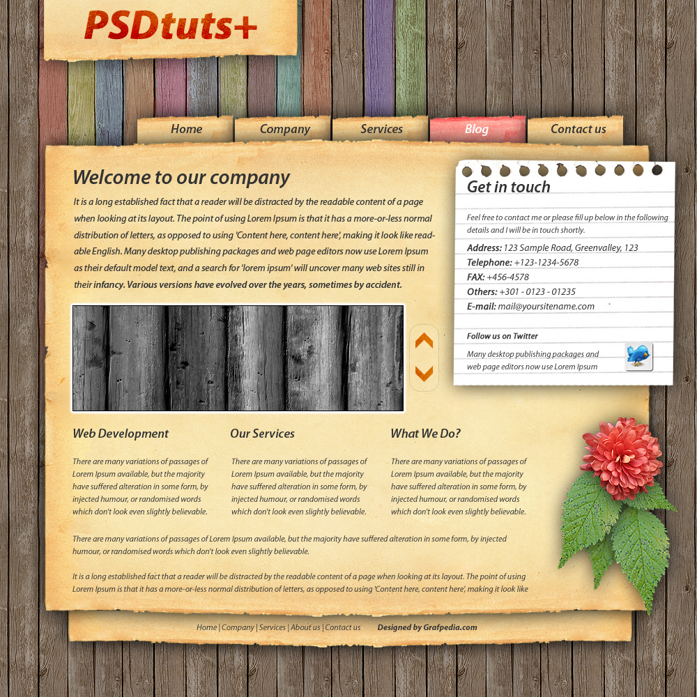
For the background, a old style color with texture background on it. Given reader a kind of feeling like back to vintage generation on this website.   

For the font, whole website was applied with old style font, special with it. And size of the font is big enough for reader to read all of content. 

For the images, 3 different style images was applied on this website, 1 is old style image, 1 is color image and 1 is illustration image on it. Given reader a comfortable feeling on this website.

For the layout, is not too much arrangement applied on this website, because fully of images . Just on gallery and schedule with grid arrangement .


0 comments:

Thursday, September 20, 2012

Some Cool Photoshop Tutorial

Give a Car Photo Super Slick Lighting Effects


Create a Dynamic Particle Explosion 


0 comments:

Beautiful Website Week 3


For the background, a colorful color with texture was used on this website, because this website is about color. So was exploring with a lot of color.

For the font, it was big enough for reader to read it. And was using different font for title, heading and body text. Easily for recognize.

For the images, a lot of images was used on this website and the size of images clear enough to view it. Some of graphic style image was appear on this website to represent graphic with color.

For the layout, just a simple layout was used. Similar as with blog layout, easier for read all content.


For the background, a simple color with romance feeling on this website. It very match to the theme. And some flower texture was used too. Make a different feel for reader.

For the font, it was suitable for this wedding theme website,  and also not using a lot of typeface on this website.While the color of text, just using 2 colors on it.

For the images, the main for the images is big and clear enough for reader to view it.

For the layout,it is a simple arrangement on this website. It doesn't have many of column.So, reader can easy to find out what information that they need. 


For the background, it just a simple color and blank background. Although it was simple, but it was give a reader a clean feeling.

For the text, a special font on title, and other than that is simple font. Even it was simple, but it was giving reader a clean feeling for the font.

For the images, a lot of graphic style images on this website, and for arrangement of images is simple way on it.

For the layout, simple and easier layout for reader, it was easy for reader to find what they want. There also put for information with simple way too.

Overall on it, this website also got applied flash on the top page of website.


For the background, a texture with grey color was applied on this website, and some decorative also was applied on it. So , it won't getting boring with the background.

For the text, a special font applied on navigation bar there. For the other just a simple font with nice arrangement. Even it's was simple , but it was applied hierarchy for font. Easy to find out where is heading where is body type for reader.  

For the images, just a few of images was used on this website. Because it just appear on top page on this website.

For the layout, also similar with blog layout. But the way, below part of website, we can find out a site-map of this website. A way to make reader find out information easier.


0 comments:

Saturday, September 15, 2012

WD1 Final Project : How To??

How to make melt chocolate strawberry ?

Who am I  - Chef
What is it  - New recipe for strawberry
What for   - Strawberry festival
1st task     - Prepare and show the materal
2nd task    -Mix the material (chocolate) = (1-3 steps)
3rd task     - Cover the strawberry with melt chocolate = (4-6 steps)
Outcome   - Many of melt chocolate strawberry in festival
Showcase  - Strawberry Gallery

How to burn calories ?

Who am I  - Body builder
What is it  - Healthy life-stuff
What for   - A person that who want diet
1st task     - Some food that we should stop
2nd task    -Way to burn calories = (1-4 steps)
3rd task     - Way to burn calories = (5-8 steps)
Outcome   - Have a healthy with great look body.
Showcase  - Info-graphic

How to bag-pack packaging ?
Who am I  - Traveller
What is it  - Journey
What for   - Visit for new environment
1st task     - A thing that should be bring
2nd task    -Tick some interesting location on map
3rd task     - Way to go
Outcome   - Capture a new environment and sharing with other
Showcase  -Map/ Photo gallery

0 comments:

Beautiful Website Week 2


Justdot

For the background, a black background with texture was used. It's represented a blackboard on this website.
For the font, it's was using chalk style font with some treatment on Verdana typeface. It's give some feeling like a scientist website for reader.
For the images, just a few images that was used on this website, cause this website is about study case website .
For the layout, just a simple layout was using on this website.


For the background, it was just a white and blue color, a simple background with readability.
For the font, a bigger and easy recognize typeface for reader to read it . It was using Arial font with some treatment on this website.
For the images, a vector images with clear resolution, easily understand for reader .
For the layout, not much of layout was using on this website, because this website is kindly like mind map website.


For the background,  a brightness color background used, its look contrast for reader.
For the font, Helvatica typeface with some treatment was used on this website, this website was using lot of treatment on this website, its look special.
For the images, a lot of images on this website, because this website is selling and promote their product website.
For the layout, left a big layout for a images, easy for reader to get 1st attention .


Cilantro Cafe

For the background, just a texture background was used on this website, to make a different feeling .
For the font, a retro style font was used. It was special and suitable for the background.
For the images, a cool art style image that was using on this website, like a kind of traditional way .
For the layout, it was interactive grid was used. 

0 comments:

2nd Week Website Tutorial


Create an impressive videographer website portfolio layout in photoshop


Colourful, funky web layout tutorial 


Creating a Clean Furniture Website and Gallery Layout in Photoshop


White Note Book style for website design  


0 comments:

Wednesday, September 5, 2012

Website analysis

Some of website analysis 


http://www.ectomachine.com/

Ectomachine

- For the background.Simple and nice background with black color, and having a paper texture overlay with background color. Make different feeling with overall of background.

- For the text. It's just using 2 different type font on this webpage, because this kind of webpage not really using a lot of type font because overall of website was complicated enough. And the color of text is matching with the background color at all. 

- For the image.A big and clear images was using on this webpage, and it was giving a clear information with each images. Images for the below side of website although it was small, but its enough clear for view it.

- For the layout. It's like a blog layout , arrangement with simple and easy way. To make reader easier to view    information. 

- For overall,this website was giving futuristic feeling to reader when first grab attention.  


Goodbysilverstein

- For the background.Simple and nice with gradient color for it (blue and dark blue), it was look contrast .

- For the text. A lot of text was using on this webpage,and simple type font for this website. The color for the text is matching with the overall color. It was giving like a night time feeling.

- For the image. A lot of images was using on this webpage too, each images was having their information. The arrangement of images was focus in the center of webpage, it was not confusing reader to view the images.  

- For the layout. Just a simple arrangement and easy layout. Because images was giving their information already, so this webpage not really need to be complicated.

-This website was giving the reader a easy and uncomplicated way to view all of information.  


Louis Vuitton (LV)

- For the background.High class standard feeling Color mood of this website . It was given reader as precious feeling with this website. 

- For the text. A lot of text font was using on this webpage, but all of the font is representive simple and clean . It was suitable for precious feeling website. 

- For the images. It was a lot of images was using , because this website is about fashion style. And some scenario images was used because to representive a meaning of menu in this website.  

- For the layout.This website doesn't have many column , because this website is about selling product website, we can easy to find out what we need. There also put some information with simple way too.

- The overall of website gives the readers a confortable ,precious and clear feeling.


Envelopments

- For the background. Simple white and grey color with some images was using on this website . It give reader a confortable and a clean feeling.

- For the text. Just using 1 of typeface on it ,a simple typeface with bold. The color of the text is match with the website, it's look naturally color for it.For this website, was using bold and different color font to represented the menu. It's easy for reader grab attention on it.

- For the images. A big and clear enough images was used ,each web direction got each images with different feeling. Because of this website is for selling product website, so it was a lot of product was apply on main page. Giving reader grab first attention on their product .

- For the layout. Just a simple and easy layout on it, a normal column system. Beside that, on the below part of this website, we can find out a social contact or email contact logo on it . To make reader easier to contact them with different way. 

- The overall of website .Its look like naturally feeling website ,because their website production is about paper and envelopment. Kinda of fresh for reader to view this website.  

0 comments:

Web tutorial by Photoshop

Web tutorial by Photoshop
This is some web tutorial that done by Adobe Photoshop 

Learn how to design a stylish Portfolio Layout in Photoshop


http://www.entheosweb.com/photoshop/stylish_portfolio_layout.asp <<< Click 


How to Make a Highly-Textured Site Layout in Photoshop 


0 comments: